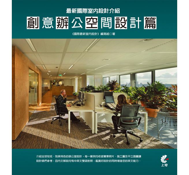
創意辦公空間設計篇--微軟維也納總部

如果想要為你的員工創造出一個親切又現代的理想工作環境,那麼首先要瞭解客戶的工作方式和他們的需求。這就是為什麼微軟就這個話題進行了多次研究。將辦公室員工分為五種類別,從「固定居民」(將辦公室作為固定的工作地點)到「遊牧人」(幾乎從來不在辦公室),通過分析辦公室的員工結構,得出優化工作地點的方案,並根據這個資訊創造出特定的室內結構。通過改善環境,員工的滿意度平均提高了10%,生產量和效率也比以往增長了12%,同時降低了二氧化碳的排放量,並產生了很多其他類似的好處。
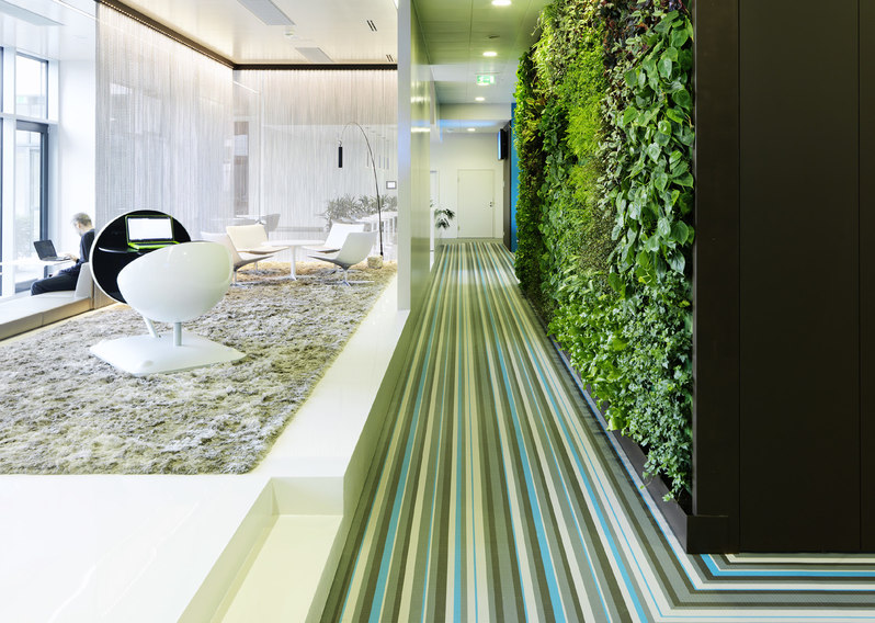
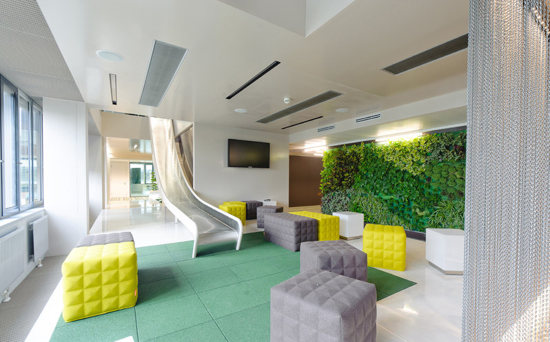
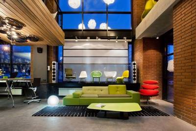
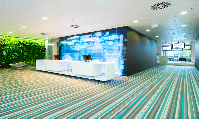
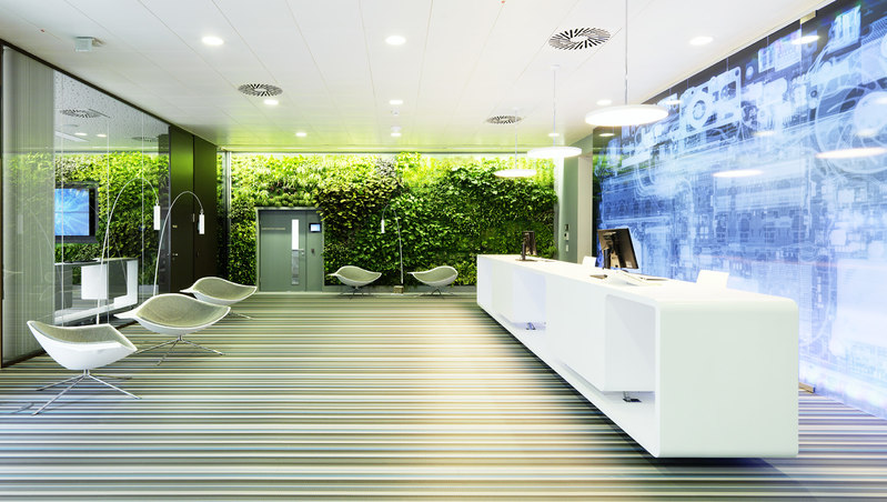
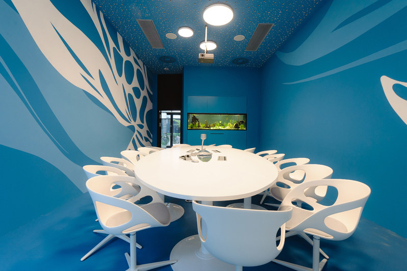
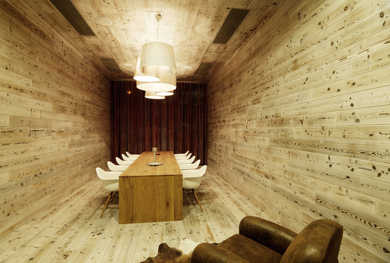
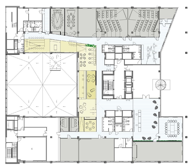
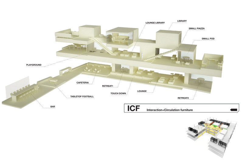
基於這樣的設計理念,4500平方米的維也納微軟總部進行了徹底的革新,甚至將此理念進行了進一步的深化,比如打破密閉的員工樓層,用一種透明的方式對其進行重新整合。一條多功能傢俱組合形成的開放的生命線貫穿整個建築,不僅為樓層創造出一個空間支架,也有利於擺放各種功能性的設施。其中最大的靈活性在於在這個封閉的會議室內,每個員工都可以根據自身的需要和心情,選擇他們理想的工作環境。
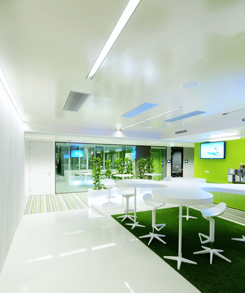
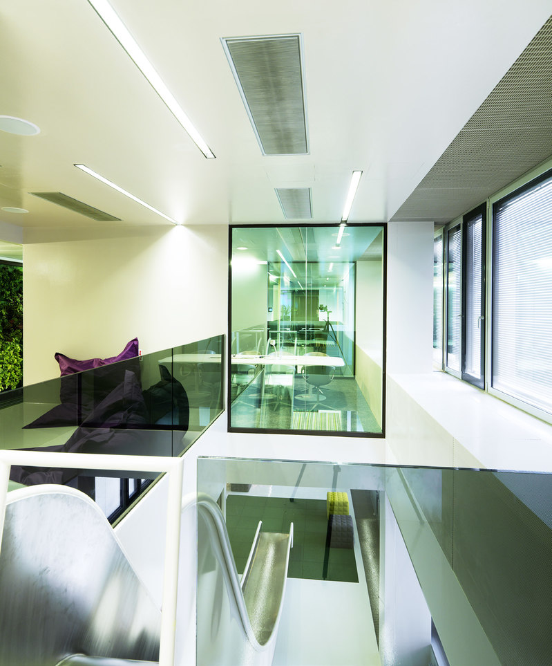
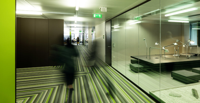
所有高流量的區域,比如走廊和門廳,都有意設計成一種動態的形式。條紋狀的乙烯塑膠地板和一個可以從二層走向一層的快速通道都採用一種象徵運動的形式,充滿動感。樓層的綠色牆體對整個空間的氛圍形成一種積極的影響。整個空間盡可能減少照明耗能。「建築生命線」上的線型光源溫和均勻地照亮整個空間,創造出一種自然的背景基調。會議室中的吊燈、落地燈、LED燈以及淺色窗簾等不同設施也通過直接或間接的燈源得到進一步的強化。
You have to know how your employees work and what they want in order to create the ideal constellation of physical, social and virtual work environments for them. This is exactly why Microsoft has conducted several studies on this topic in recent years. The result is the Work Place Advantage Concept, which analyses the employee structure of every branch office on the basis of five categories, from the Resident (fixed workstation, always in the office) to the Nomad (hardly ever in the office), and uses this information to create a custom-tailored interior programme.An average of 10 per cent greater.
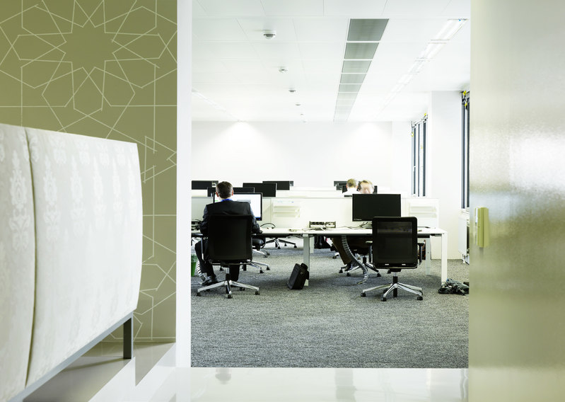
employee satisfaction, a 12 per cent increase in productivity and efficiency,improved CO² footprints and many other similar benefits can be expected – and some can even already be measured. The complete renovation of the 4,500 m² headquarters in Vienna took this concept to heart and even took it one step further: the “sealed-off ” employee floors were broken up and arranged in a transparent manner. An architectural life line traverses the entire building in the form of accessible, multi-functional furniture, providing a spatial bracket around all of the floors, and facilitates a variety of functional settings. The greatest possible flexibility is also provided in the closed meeting rooms: Every employee can select their ideal environment, according to their needs and mood.
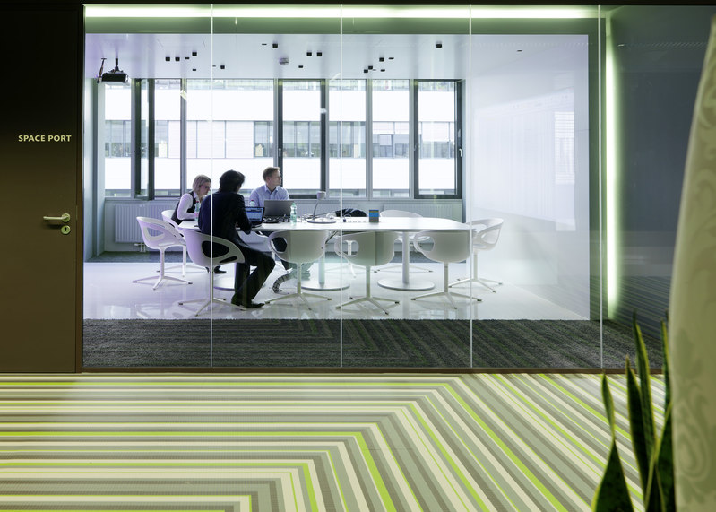
All high-traffic areas,such as corridors and foyers, were designed to be intentionally dynamic. The striped vinyl floor and a slide that allows quick access from the second to the first floor both symbolise movement. The accompanying green walls in all of the floors have both an atmospheric and positive effect on the climate of the space. The lighting concept works with as few light sources as possible. Neutral, uniform lighting in the form of linear light elements in the “life line” creates an atmospheric undertone. The different settings of the meeting rooms are also reinforced by direct and indirect lighting with pendant, floor-standing and table luminaires, and even LED walls and light curtains.
HEADQUARTER MICROSOFT
ProjectName/項目名稱:Headquarter Microsoft Vienna
Location/地點:Österreich
Area/面積:4500m2
Client/業主:MicrosoftÖsterreichGmbH
Design Company/設計公司:ARGEKOOP / INNOCADArchitekturZTGmbH
Photos/攝影:©PaulOtt,Graz ; ©ChristianDusek
原文出處:《最新國際室內設計介紹:創意辦公空間設計篇》
作者:《國際最新室內設計》編寫組
出版社:上奇資訊
http://www.books.com.tw/products/001071407
