 上奇資訊
發表於2016/05/03
“HOT PAPER” RESTAURANT & MODERN FOOD
Project Name / 項目名稱:“Hot Paper” restaurant & modern food
Location / 地點:Tczew Poland
Area / 面積:98m2
Design Company / 設計公司:Wamhouse
Photos / 攝影:Mariusz Warsinski, Wamhouse
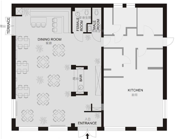
Dining Room Area 就餐面積=98m2
Kitchen Area 廚房=70.1m2
Female Room Area 女衛Th間=4.2m2 Male Room Area 男衛Th間=2.7m2
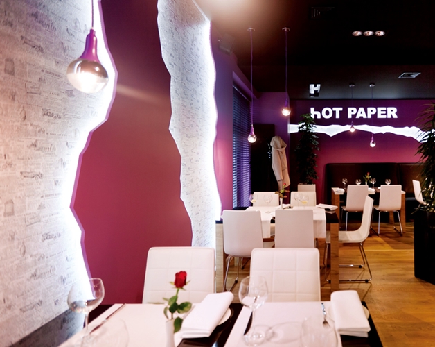
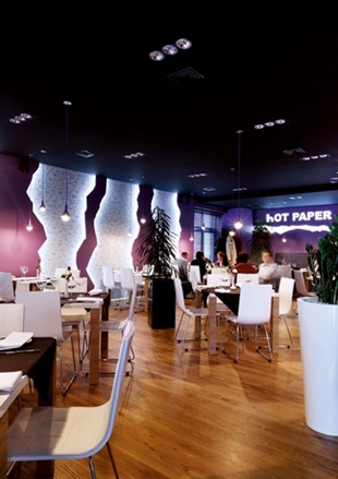
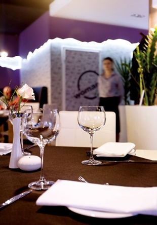
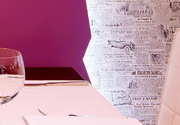
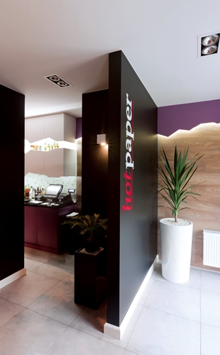
餐廳的設計不僅包括空間的裝飾裝修,還包含對其名字、商標的設計,這體現了其整體形象。這家餐館設計的最鮮明特色是以報紙為主題,體現在餐館名字和它的內部設計上——包括壁紙、「碎」牆和傢俱。業主期待客人對餐廳名字感到好奇又吃驚,從而對食物充滿期待。
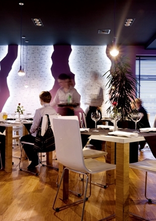
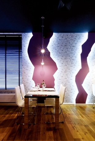
餐廳的面積只有 98 平方米,因此在遵守工程學的前提下,把酒吧與前廳進行合理地分隔,充分利用空間。設計特意地不孤立每一張桌子,這樣從每個角度都能看見「碎」牆效果,為了創造更多生機,添置了許多盆花。
在餐廳的設計過程中,主要應用了 5 種材料—天然橡木,貼有報紙的動態牆紙,灰白乳色、黑色、紫色的瓷磚。還使用了多種多樣的照明設施,尤其在晚上,光照凸顯了凹凸不平的輪廓。在洗手間裡,不僅有報紙,還鋪設了印有各個城市名字的乳白色的瓷磚。最有趣之處是在洗手間還播放著教授外語單詞和短語的錄音課程。
除了黑色瓷磚,設計師增加了灰白乳色的瓷磚,並增添了鮮亮的色彩—女衛生間是粉色的,男衛生間是石灰綠色的。這些顏色出現在牆上、光滑的石膏上,以及線條筆直的帶有裝飾的加熱器上。
The restaurant design included not only interiors, but also the name of the restaurant, logo and elevation, that is comprehensive image setting. The leading element is a newspaper motif, which appears both in the restaurant name and in the interior itself - in the form of a wallpaper as well as “torn” walls and furniture.
The guests of the restaurant were supposed to be surprised with the name thereof, not knowing what to expect - hot news or meals from a hot newspaper. The dining room surface area is only 98m2, so it was necessary to suitably separate the bar from the vestibule without wasting surface and observing particular rules of ergonomics.
We left the tables non-isolated deliberately, so that the element of torn walls was visible from everywhere, but in order to give the interior more life, we added several large flowers. In the design of the dining room, we applied mainly 5 materials - natural oak wood, wallpaper with newspaper motive, grey milked rock tiles, as well as black and violet. We also went with abundant illumination which - particularly afternightfall - emphasizes the jagged wall contours. In the restrooms, there is not only the newspaper itself, but also milled rock tiles with printed names of cities.
An interesting point are records which can be heard in the restrooms, featuring lessons of foreign words and phrases. Apart from black, we supplemented the grey milled rock tiles with vivid colours - punk in the ladies’ restroom and lime green in the men’s restroom. These colours occur on walls in the form of a permanent, smooth plaster, and on vertical decorative heaters.
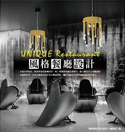
原文出處:UNIQUE Restaurant:風格餐廳設計
作者:《國際最新室內設計》編寫組
出版社:拓客
http://www.books.com.tw/products/0010647727
